Techmobile
Affichage des articles dont le libellé est reviews. Afficher tous les articles

samedi 15 octobre 2016


As if you needed another example of Android's open-source awesomeness, there's already a flashable ZIP that will give you almost all of Google's Pixel-exclusive features on other devices—and the Pixel isn't even officially out yet!
The new boot animation, Pixel Launcher, wallpapers, ringtones, and even more Pixel features can be added to your rooted Android in just a few quick taps.
The flashable ZIP comes courtesy of developer FaserF, as heput together a collection of the leaked Pixel features to make them all easier to install. At the same time, we owe some thanks to LlabTooFeR for leaking the firmware from the Pixel and Pixel XL, which is where all of these goodies came from.
Google's trying to give the Pixel an edge by adding bonus features that won't be available on other Android devices for quite some time. But thanks to this easy mod, you don't have to wait, nor do you have to purchase a new phone, because you can get the Pixel's best features right now.

Requirements

What You'll Get

This all-in-one flashable ZIP gives you five of the leaked Pixel-exclusive features in one shot. I'll list the features below, but if you're interested in any of these individually, just click the corresponding link to see our full guide for getting that particular feature by itself.

Step 1
Download the All-in-One ZIP

First up, just download the all-in-one flashable ZIP from the link below, then boot your phone into recovery mode.

Step 2
Make a Backup

Even if your phone is running Marshmallow, there's a chance that this ZIP won't be compatible with your device. So to make sure you have a fallback plan in case anything goes wrong, you should make a full NANDroid backup first.
To do that, simply tap the "Backup" button from TWRP's main menu, then swipe the slider at the bottom of the screen. It'll take a few minutes, but when it's done, you'll have a restore point to work with. Should you need to restore this backup in the future, just boot into TWRP, tap "Restore," then swipe the slider.

Step 3
Flash the ZIP in Recovery

Next up, tap the home button at the bottom of the screen to head back to TWRP's main menu. From here, press "Install," then navigate to your Download folder, and select the PixelExperience.zip file. After that, just swipe the slider at the bottom of the screen to install the mod, and when that's finished, tap "Reboot System."

Step 4
Try the New Features

As soon as you reboot after applying the mod, you'll notice one of the major changes right up front. If everything went off without a hitch, you'll see the Pixel's brand new boot animation while your phone starts up.
After that, just make sure to set Pixel Launcher as your default home screen when prompted, then you'll be all set to go. The new launcher has tons of cool tweaks, including a wallpaper picker with awesome Google images.
Then, of course, you've got the new dialer with its revamped interface. You'll also find that your system sounds have been updated to the new versions, and the Pixels' ringtones and notification sounds will be added to your existing tones, so it's all new all around.

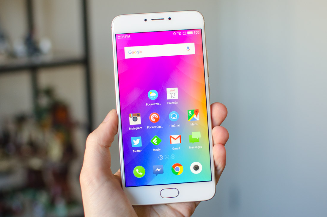
Meizu is one of many Chinese smartphone manufacturers that have seen strong success in their home country, but have struggled to break into Western markets in the highly crowded budget smartphone space. Their devices are known for packing in a great array of hardware at an extremely low price, rivalling well-known Chinese giant Xiaomi in this regard.
The phone I have with me today is the Meizu m3 Note, a 5.5-inch budget device with an attractive price tag of just $170. This places it in direct competition with one of my favorite budget devices, the 3rd-generation Motorola Moto G, along with the mediocre Umi Touch I reviewed a couple of weeks ago.
The m3 Note could fall into the trap of offering good hardware but failing to use it properly; it’s a common thread among budget Chinese OEMs. However, with Meizu having produced smartphones since the early days of Android, the company has had years to refine their offerings. The m3 Note in particular is the third device in Meizu’s large screen series, which began in late 2014 with the launch of the original m1 Note.
I’ll be looking at the hardware in greater detail later, but there’s a lot of quality in this device at its price. There’s a 1080p IPS LCD on the front, an octa-core Helio P10 SoC on the inside, a huge 4,100 mAh battery, a fingerprint sensor, and a 13-megapixel rear camera. This sounds like a pretty decent collection of hardware for a sub-$200 handset.
I’m not mincing words when I say this: the Meizu m3 Note has the best build quality of any budget device I’ve used. The m3 Note could easily sit among flagship smartphone, such is the quality of this metal body. It’s not the most visually impressive handset – Meizu’s design team has clearly used theiPhone 6s Plus as inspiration for this build – but there is no shortage of premium materials or attention to detail here.
Most of the m3 Note’s back is a single piece of 6000-series aluminium, which comfortably curves around each of the long edges to create a near-unibody design. It’s rare for a budget device to use such nice metal, and it both looks and feels superb here. I especially like the clean, sleek look that Meizu has implemented, allowing you to enjoy the materials without intrusive branding or clutter.
The Meizu m3 Note sitting next to a 3rd-generation Motorola Moto G
Above and below this metal slab are two plastic sections designed to imitate the rest of the metal body. As these sections are separated by a neat, polished strip of metal, I don’t think they look too bad. The plastic sections certainly don’t have the same textural qualities of the metal, however in normal use you don’t have to touch these areas, and visually they fit in acceptably with the overall design of the m3 Note.
One of the things I really appreciate about the m3 Note’s design is the attention to detail. The build is near-perfectly symmetrical, which shows Meizu has really thought about the placement of some elements, like the camera and sensors above the display. The lack of noticeable seams speaks volumes about the solidness of this build, which translates to a great feel in your hands. These are the sort of things you typically see from high-end devices, not budget devices.
The solid volume rocker and power button are found in a comfortable location along the right-hand edge. In general, this phone is very ergonomic, thanks to comfortable curves around each of the edges and corners. I was also pleased with the thickness (8.2mm) and weight (163 grams), which is nothing groundbreaking but respectable considering there’s a huge 4,100 mAh battery inside.
Interestingly, the m3 Note is smaller and lighter than the iPhone 6s Plus in every way bar depth (the 6s Plus is 1mm thinner). Both phones have 5.5-inch displays, yet smaller bezels on the m3 Note make it slightly easier to use in one hand. Neither device is particularly friendly to those with small hands, though, as the display size is still above average.
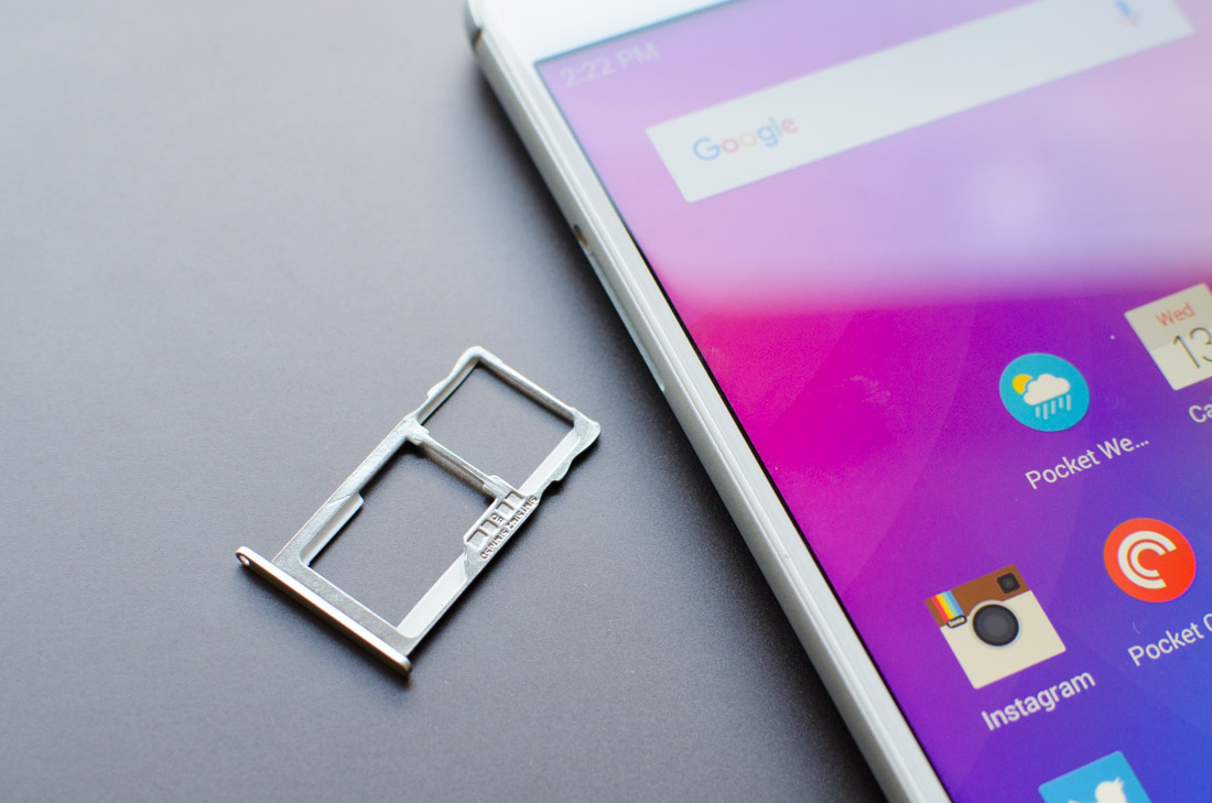
The m3 Note is loaded with two speakers along the bottom edge, which as you might expect aren’t great quality. Between the speakers is a micro-USB port, the standard port used for charging and data transfers in budget devices. I don’t expect USB-C to filter down to these devices for a while now, so I have no complaints there. Along the top is a 3.5mm headphone jack, and on the left edge is a tray for housing either two nano-SIMs, or a nano-SIM and microSD card.
The other notable feature to this phone’s design is the fingerprint sensor found below the display. The sensor is surprisingly fast and accurate for a cheap smartphone, and I had no trouble using it to secure the device. This technology has come a long way since early iterations, and it’s great to see it now being cheap enough to include in budget devices.
Interestingly, there are no physical capacitive or on-screen navigation buttons on the m3 Note, aside from the fingerprint sensor which doubles as both a home and back button. Pressing in the sensor like a button returns to the home screen, while just tapping it like a touchscreen acts as a ‘back’ command. It’s a unique way to navigate, and something I haven’t seen outside of Meizu devices. Personally I prefer standard navigation buttons, but this single-button solution is fine when you get used to it.

It’s no secret that Sony’s smartphone business is struggling. Competition has become fierce over the last couple of years, with continued innovation and lower prices causing trouble for market incumbents. Rather than doubling down on their flagship products, like HTC did with their excellentHTC 10, Sony seems happy to trundle along with minor iterations year after year.
The new Xperia X series may not carry the same name as its predecessor, the Xperia Z, but there’s no mistaking these products for a revolutionary change. I've been testing the the top-end Xperia X Performance for a few weeks now and I've found it to be remarkably similar to the Xperia Z5 that preceded it. Considering the Z5 was the sixth derivation of the 3-year-old Xperia Z, it’s easy to feel this design is getting stale.
The similarities between the Xperia X Performance and the Xperia Z1 in particular are striking. Released in 2013, the Xperia Z1 came with a 5.0-inch 1080p display; in 2016 we’re still seeing a 5.0-inch 1080p display on the X Performance. Both phones are water resistant. Both phones have cameras with more than 20 megapixels, and both have dedicated shutter buttons.
So what has Sony managed to achieve in three years? Well, the Xperia X Performance ditches the Snapdragon 800 SoC for the modern Snapdragon 820, bringing along better connectivity, more storage, and more RAM. The front camera is up to 13 megapixels now, while Sony claims the rear camera is their fastest ever. Unbelievably, we’re getting a smaller battery in a phone just as thick. Plus we’re getting some new software features, too.
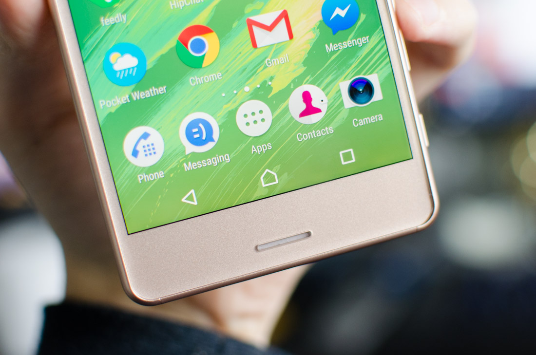
When I first picked up the Xperia X Performance at MWC 2016, and then again for this review, I couldn’t help but feel that the design is bland. I’ve seen this exact sort of smartphone style from Sony more than three years ago, and it seems that as competitors have got slimmer and sexier, Sony’s designers have gone backwards.
There are very few aspects to the Xperia X Performance that are visually more appealing than my favorite Sony smartphone design: the Xperia Z3. Since that phone's release in 2014, Sony’s flagship device has gained a millimeter of thickness, lost the comfortable and stylish curved edges, and swapped premium materials for plastic in some areas.
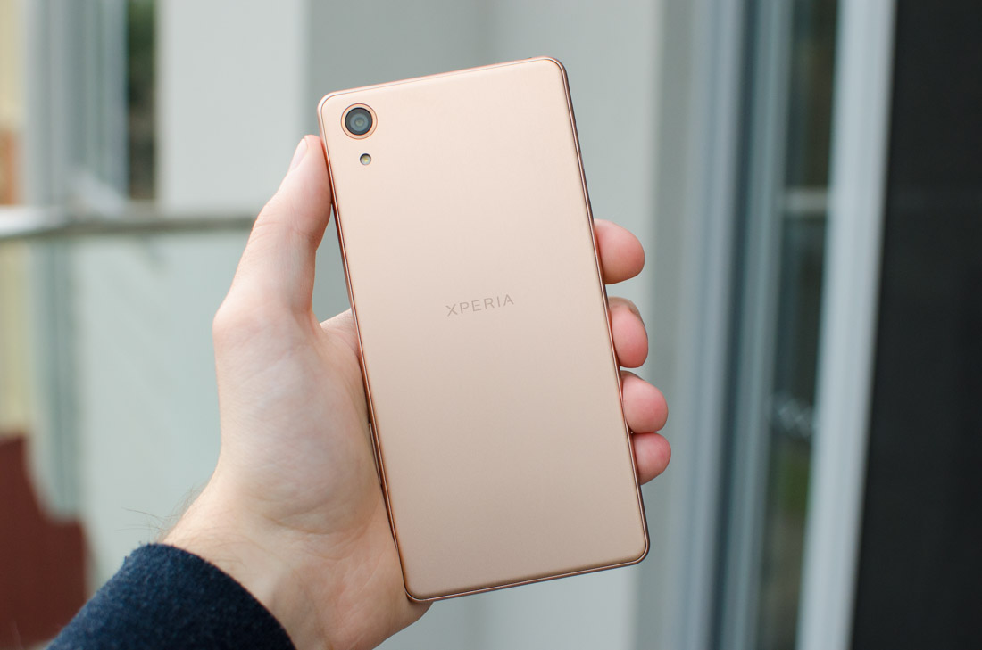
On Sony’s product page, the company is quick to highlight the sleek metal back panel, which I will admit looks great thanks to a subtle brushed finish and minimal distractions, but the plastic edges let this handset down; they look cheap and don’t carry the same textural pleasure. Sony has tried to color these edges to look the same as the rear panel, but it hasn’t worked: the visible seam that joins the back panel to the sides is unsightly, and the difference in luster between metal and plastic is obvious.
Placed next to the similar Huawei P9, it’s clear what Sony should have done in designing the Xperia X Performance. The P9’s metal unibody looks and feels fantastic, as the premium materials curve seamlessly around the edges. The Xperia X Performance’s transition from metal to plastic looks ugly in comparison, and gives the impression that Sony’s creation is the cheaper device.
It’s not.
The metal back does have its advantages. There are no antenna lines which are usually necessary on a unibody design and can detract from the style. The Xperia X Performance is also easier to grip than its Xperia Z series predecessors, which used fragile glass backs that were prone to cracks, as well as being slippery fingerprint magnets.
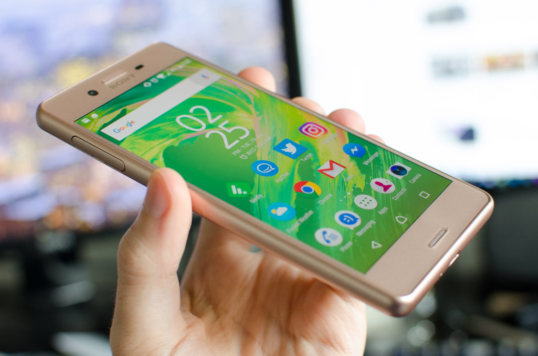
The front panel is constructed from a slab of glass protecting the display, which subtly curves into the edges, creating a swooshable feel. The bezels are average in size for a 5.0-inch smartphone, and are colored to match the edges and back panel. I’m not a fan of this single-tone design – it looks a bit boring – and the rose gold model I received to review is not something I’d normally choose to buy. That said, the X Performance is also available in white, black and “lime gold.”
The Xperia X Performance is one of the very few remaining flagships to pack dual front-facing speakers, which provide a stereo experience when watching video and playing games. I love stereo speakers on the front of smartphones, and it’s sad to see companies like HTC move away from this. The quality of the X Performance’s speakers isn’t particularly great, but their volume is decent and I don’t expect amazing sound from such small drivers.
Along the bottom edge of the Xperia X Performance is a micro-USB port, which is disappointing considering most high-end devices have transitioned to the more versatile USB-C port. Samsung is the other outlier here, as they have their Gear VR system which still uses micro-USB. Sony doesn’t have anything like that, so I’m puzzled as to why they didn’t update their charging and data port to the modern standard.
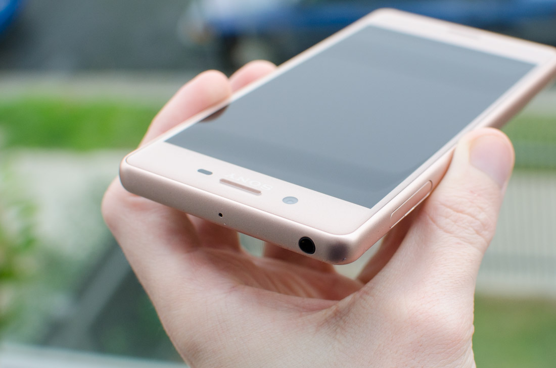
The top edge features a 3.5mm headphone jack, while the left edge has a tray for either two nano-SIMs, or a nano-SIM and microSD card slot. I appreciate seeing dual-SIM functionality here, as it isn’t often found on high-end smartphones.
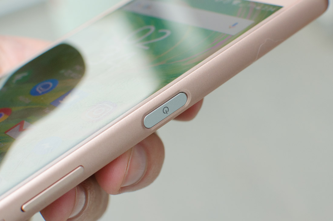
On the right edge is the fingerprint sensor, which doubles as the power button. I was critical of the Xperia Z5’s fingerprint sensor in this location as it didn’t seem to work very well, but these issues have been resolved on the Xperia X Performance.
This sensor is ludicrously fast to operate, much more accurate than its previous implementation, and the positioning is just about perfect. My only concern is that the tactile feedback from the button isn’t great, and it might've made the phone thicker than necessary.
Below the fingerprint sensor is the volume rocker, which is in an awkward position due to its low position on the right-hand edge. A more comfortable location here would be above the fingerprint sensor, and there would be less chance of accidental presses as well. Below the volume rocker is the dedicated two-stage camera button.
The Xperia X Performance is water resistant, carrying an IP65 and IP68 rating that allows immersion in fresh water up to 1.5m for up to 30 minutes. It’s also dust tight and resistant to low pressure water jets. It’s always handy to have a water resistant phone for the times it accidentally gets dropped in the toilet or splashed with coffee, but under no circumstances should the X Performance be taken into salt water.
As far as usability is concerned, the Xperia X Performance’s 5.0-inch display makes this smartphone easy to use with one hand. At 8.7mm thick it’s a chunkier than I would have liked to see, especially as the phone doesn’t pack in a large battery, though it remains more portable than handsets with larger displays.

2016 Flagship Killer. That’s the tagline that OnePlus used for the 2015 OnePlus 2, a claim that in hindsight seems ridiculous. Sure, the OnePlus 2 was a decent smartphone for the price, but it wasn’t the best phone of last year, let alone this year. OnePlus should have reserved this tagline for this year’s smartphone, because the OnePlus 3 is a superb piece of hardware at a very affordable price point.
It’s not just the hardware that impresses: OnePlus has finally ditched their ludicrous invite system, so anyone should be able to purchase the OnePlus 3 with relative ease. For a phone that’s sure to be popular over the next twelve months, availability is key.
Priced at $400, the OnePlus 3 does not compromise on hardware. This 5.5-inch handset is powered by a modern Snapdragon 820 SoC, and there’s a huge 6 GB of RAM complemented by 64 GB of storage as standard. There’s also a fingerprint scanner, USB Type-C, a 16-megapixel rear camera with OIS, and dual-SIM support.
There’s tough competition at the high end this year – the Galaxy S7 Edge, HTC 10, Huawei P9, and even last year’s Nexus phones and the iPhone 6s Plus are all fantastic devices – but they simply don’t have the price advantage of the OnePlus 3.
This poses the question: why spend more on a device from Samsung or HTC when you can get similar functionality from the OnePlus 3? Or is there an advantage to these pricier competitors? Let’s find out.
The build of the OnePlus 2 was acceptable, but its successor pulls out all the stops to be one of the most beautiful designs of the year. It’s slim, it’s sleek, and it uses premium materials: all key design aspects I love to see in high-end smartphones. Most importantly it feels fantastic in the hand, and there’s no doubt that OnePlus’ design team has improved dramatically since their first smartphone.
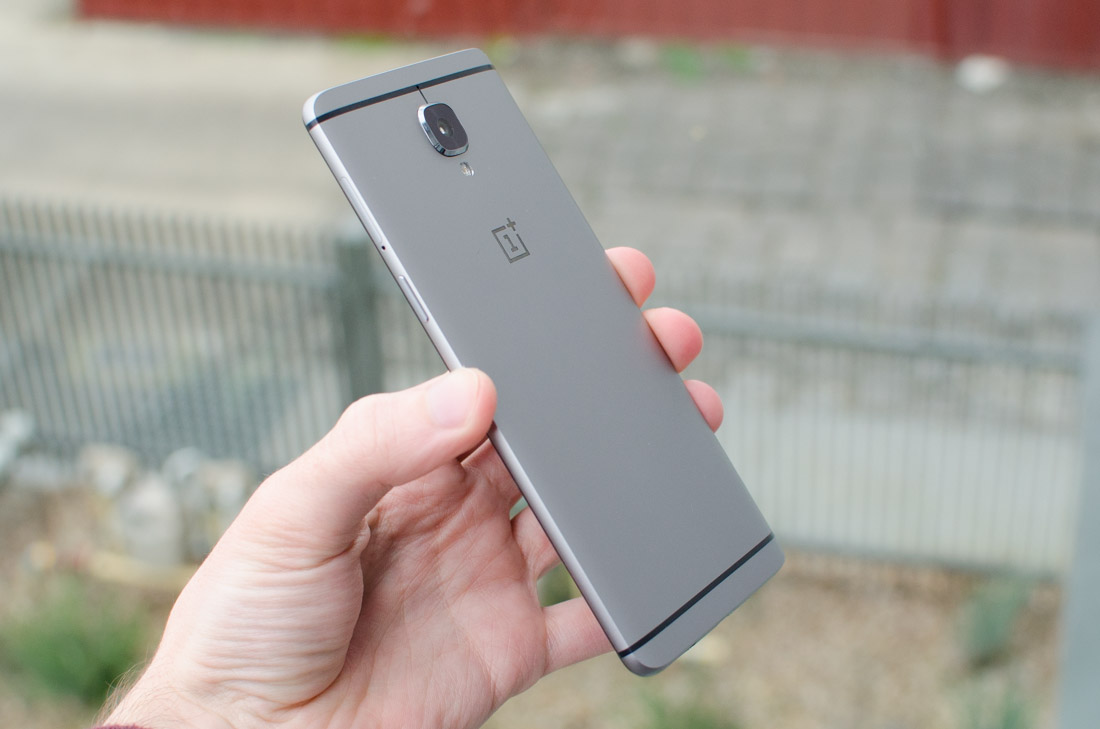
The OnePlus 3 features precision and attention to detail throughout the build that is reminiscent of the iPhone, known for its high quality design. This phone uses a solid metal unibody that encompasses the entire back of the handset, and wraps comfortably around the edges. Naturally this leads to the introduction of antenna lines, which, colored black, complement the lustrous matte metal quite well.
The corners of this device have been rounded to fit comfortably in your hands, and the back panel is curved slightly to assist with ergonomics and make the handset look slimmer than it is. With a 5.5-inch display on the front, the OnePlus 3 is a bit larger than is comfortable for one-handed use, but OnePlus has worked hard to make this phone comfortable to hold and easy to grip. The metal back has the added bonus of resisting visible fingerprints as well.
I was impressed by how slender the OnePlus 3 is, both visually and technically. While the left and right edges slim down to under 5mm, the entire handset is just 7.4mm thin; more than 2mm slimmer than the OnePlus 2. This greatly improves how the handset looks and feels, although it does result in a 300 mAh reduction in battery capacity, which now sits at a standard 3,000 mAh.
The reduction in thickness has led to a raised camera module, which protrudes from the back by around 1mm. There is a slight rim around the camera glass, so I don’t believe it will be damaged in general use, but when placed on a table, the OnePlus 3 does rock noticeably when you’re tapping the touchscreen in the corners. Some people are not a fan of camera bumps for this reason.
The front panel is Gorilla Glass, which curves beautifully around the edges to create a display without a harsh bezel edge. This improves swooshability, and without a metal rim around the glass, there’s nothing to dig into your hands during use. Not every high end smartphone uses this sort of glass design, but it’s becoming more common and I love it.
The bezels around the display are slim, particularly on the left and right edges, which improves usability. The OnePlus 3 is smaller than the 5.5-inch iPhone 6s Plus in all dimensions bar thickness (and the OnePlus 3 is only 0.1mm thicker), though the iPhone has particularly massive bezels for a high-end handset.
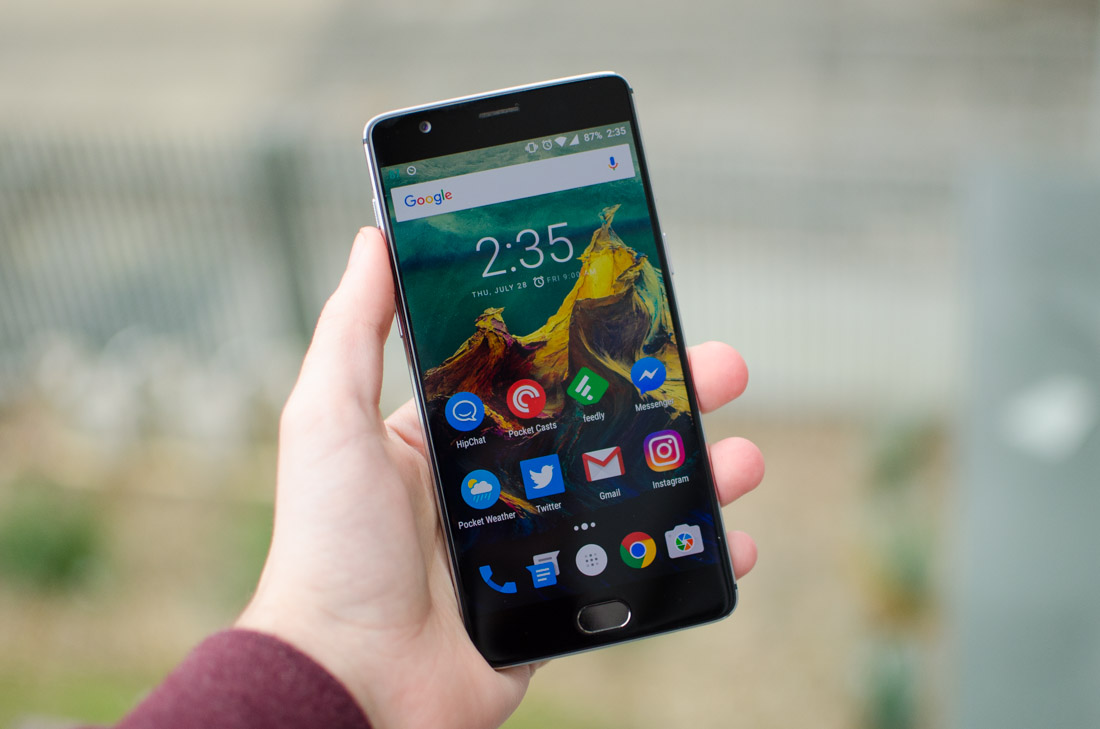
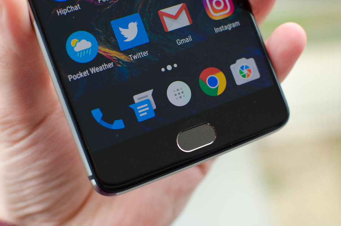
Below the OnePlus 3’s display is a fingerprint sensor that doubles as a home button. Unlike with the OnePlus 2, this fingerprint sensor is very fast and accurate, which makes it perfect for securing the device. I prefer to see the fingerprint sensor on the rear of the handset – it’s more natural and comfortable – but having a sensor is better than not having one.
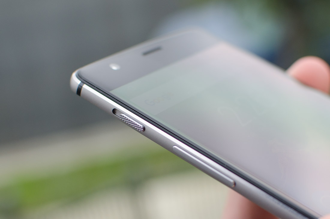
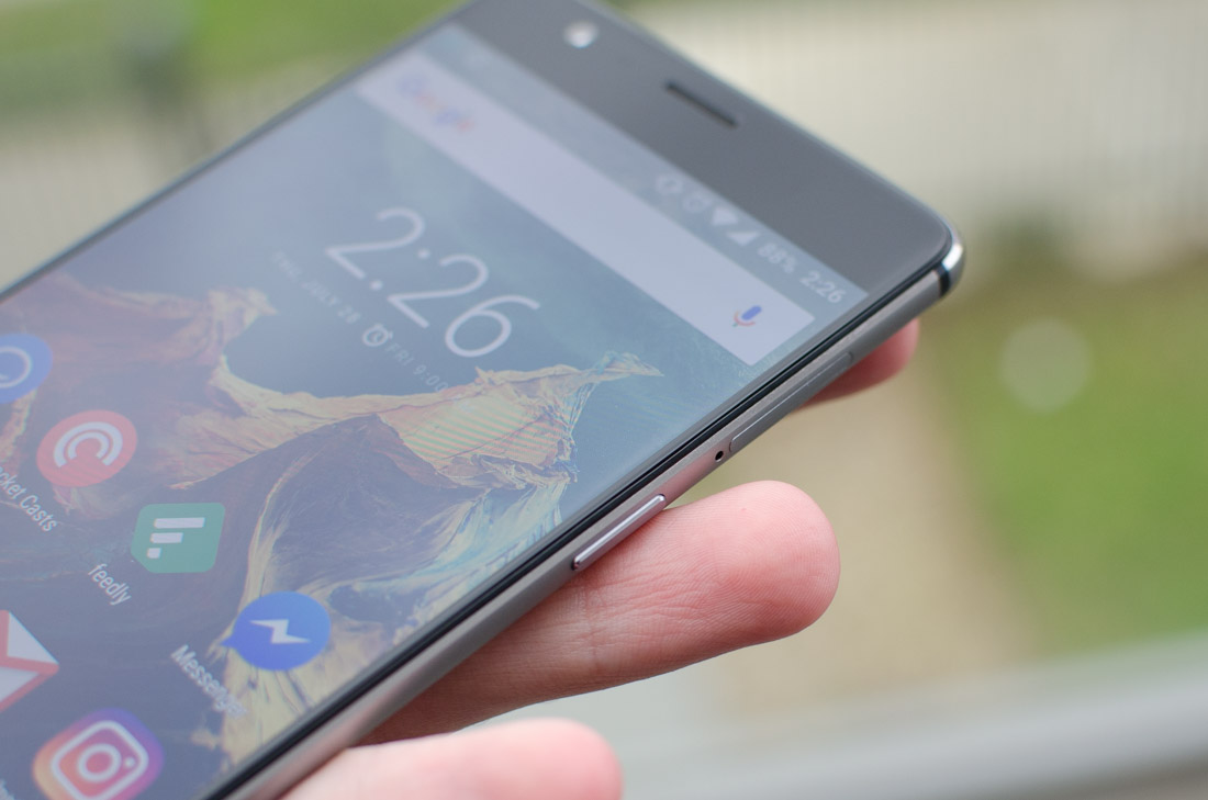
Around the edges of the OnePlus 3 you’ll find the power button in a comfortable location on the right side, while the volume rocker sits on the left. Also on the left is an alert slider with three positions, which can be used to quickly switch between receiving all notifications, just priority notifications, or none at all. This slider was seen on the OnePlus 2, and I didn’t end up using it all that often; it’s a similar story on the OnePlus 3.
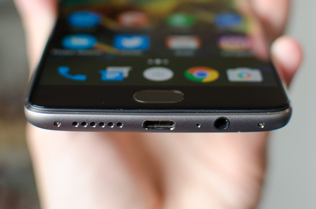
Along the bottom edge is where you’ll find everything else. There’s a USB Type-C port for charging and data transfers, and while this port only supports USB 2.0 speeds, the reversible plug is great for usability. There’s also a 3.5mm audio jack, and the single bottom-firing speaker. No front-facing stereo speakers here, so you’ll need to cup your hands to get a good audio experience while watching videos. And as you’d expect, the speaker is average in quality and volume.
The OnePlus 3 has the option of using either capacitive hardware navigation buttons, or on-screen buttons. By default, the button to the left of the fingerprint sensor is ‘back’, while the one on the right opens the app switcher, however the functions of these buttons can be changed in the settings. This is why OnePlus uses basic backlit dots to denote the location of the buttons, rather than icons.
Above the power button on the right-hand side is a tray that houses two nano-SIMs. The OnePlus 3 has dual-SIM functionality, but there is no microSD card slot, similar to the OnePlus 2. Normally I’d say this is a problem, and it was for the 16 GB models of the OnePlus 2, however the OnePlus 3 comes with 64 GB of storage as standard. This should be plenty for most users, negating the need for a microSD card slot in most circumstances.


In the past, I’ve had no trouble recommending Motorola’s Moto G line for those after a fantastic budget smartphone. Even now, the 2015 Moto G is still a great choice, as it delivers solid performance and a decent camera in a cheap, stock Android package. Up against products that feature great spec sheets but aren’t optimized in the slightest, Motorola has historically delivered well rounded and dependable devices.
In 2016, Motorola has expanded the Moto G line to include three devices: the Moto G4, the Moto G4 Plus, and the Moto G4 Play. The new line-up is a little confusing, so let me explain it to you in dot-point form.
  • The Moto G4 Play is the most economical handset, featuring a 5.0-inch 720p display. It’s basically the same as the 2015 Moto G, except for a downgraded camera and larger battery. It’s also not yet available.
  • The Moto G4 is the middle child. It launched at a more expensive price than the Moto G 2015, but it packs better hardware, including a 5.5-inch 1080p display and Snapdragon 617 SoC.
  • The Moto G4 Plus is very similar to the Moto G4. It uses the same display, same SoC, and has the same design. However it’s more expensive as it upgrades the camera and includes a fingerprint sensor.
The phone I have on the test bench today is the Moto G4 Plus, which sells for $250. That's $50 more than the Moto G4 and almost pushing it from budget territory into mid-range. Perhaps more importantly, the G4 Plus is $70 more than the excellent 2015 Moto G, so Motorola is hoping the collection of hardware upgrades will be enough to tempt people into spending the extra cash.
There is no mistaking the Moto G4 Plus for a high-end handset. The phone is constructed from plastic, which gives it a lightweight but very generic feel. In the past I have forgiven Motorola for using plastic in their Moto G line, however I’ve since used the Meizu m3 Note which impressed me with its stunning metal build in a phone that costs less than the G4 Plus.
The rounded rectangular slab in the G4 Plus is thinner than its predecessor, but at 9.8mm thick it’s not set to break any records. The back panel is slightly textured, yet it still manages to collect fingerprints that are noticeable in the light. The edges are comfortable though aesthetically uninspiring.
There’s no longer a distinct curve to the rear of the Moto G, however the signature Motorola dimple, which is positioned in a comfortable location to assist with grip, has remained. The rest of the design has been simplified, and in my opinion this works against Motorola, as the Moto G4 Plus doesn’t stand out from the crowd. Motorola phones previously used a more distinct design language, however the G4 Plus feels as though it has been turned into another generic Lenovo handset.
The good news is that the bad aspects to the Moto G4 Plus’ design are mostly visual. This 5.5-inch handset is comfortable to hold and operate with one hand thanks to perfect power button placement and sensibly curved edges. The increased screen size makes the G4 Plus notably larger than the 2015 Moto G, which may disappoint those after a more user friendly 5.0-inch display, however the extra screen real estate does improve the multimedia experience.
Aside from the Motorola dimple, the back panel includes a reasonably ugly camera array that includes a two-tone LED flash and a hidden laser autofocus system. All the hardware is there, though the raised section that includes it all is a visual regression coming from the 3rd-gen Moto G.
The plastic back panel can be removed, revealing two micro-SIM slots and a microSD card slot. There’s no removable battery although with three slots I can understand why Motorola chose a removable back rather than a large tray. While nano-SIM is now the SIM standard, rather than micro-SIM, the Moto G4 Plus actually includes nano-to-micro adapters for those with newer SIM cards.
On the front of the Moto G4 Plus is the display protected by Gorilla Glass 3. Above the display is the location of the single speaker, which acts as both the in-call speaker and the loudspeaker for ringtones and media. It’s great to see a front-facing speaker here, even if it isn’t a stereo setup, the quality is surprisingly respectable.
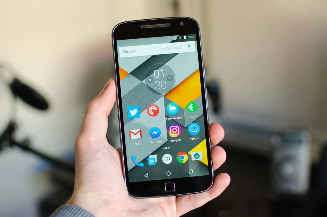
Below the display is one of the features unique to the Moto G4 Plus: the fingerprint sensor. The performance of the sensor is good – it’s not the fastest I’ve used, but it’s accurate – however I’m not a fan of the design. Rather than featuring an inset sensor (like the OnePlus 3 and iPhone 6s) or a large sensor that doubles as a home button (like the Samsung Galaxy S7), the G4 Plus uses a small square sensor with a noticeable rim. The rim makes it easy to find the sensor, however the way it protrudes is neither comfortable nor visually appealing.
I also kept trying to press the fingerprint sensor like it was a home button; it’s not, and only acts as a security device. The Moto G4 Plus uses on-screen navigation buttons, so this can take some time to get used to.
Around the edges of the handset you’ll find a 3.5mm headphone jack on the top, the power and volume buttons on the right-hand edge, and the micro-USB port on the bottom. Nothing too special to see here.